The internet is full of courses offering to teach you how to make money trading forex or shares. Spend a bit of time googling, and before you know it your social media will be filled with ads offering infinite wealth. I’m sure somewhere on the net is legitimate training, but the majority are obviously bogus.
One of the cornerstones of trading courses is the use of indicators, and there are as many indicators as there are trading courses, but do any of them work? Can we test them?
This article is about a process I developed to see if any of the most common indicators had any predictive ability.
Firstly what is a trading indicator and how are they used? One of the most well-known indicators is the Bolinger bands. Bolinger bands use a moving average of the price (black line in the center) and standard deviation for the upper and lower bands. A buy signal is created when the price closes below the bottom band (green areas), and a sell signal is when the price closes above the upper band. Easy!
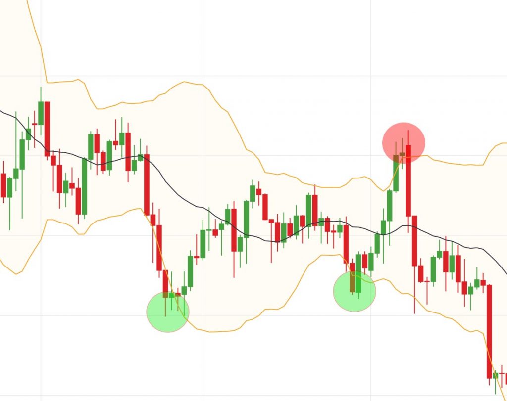
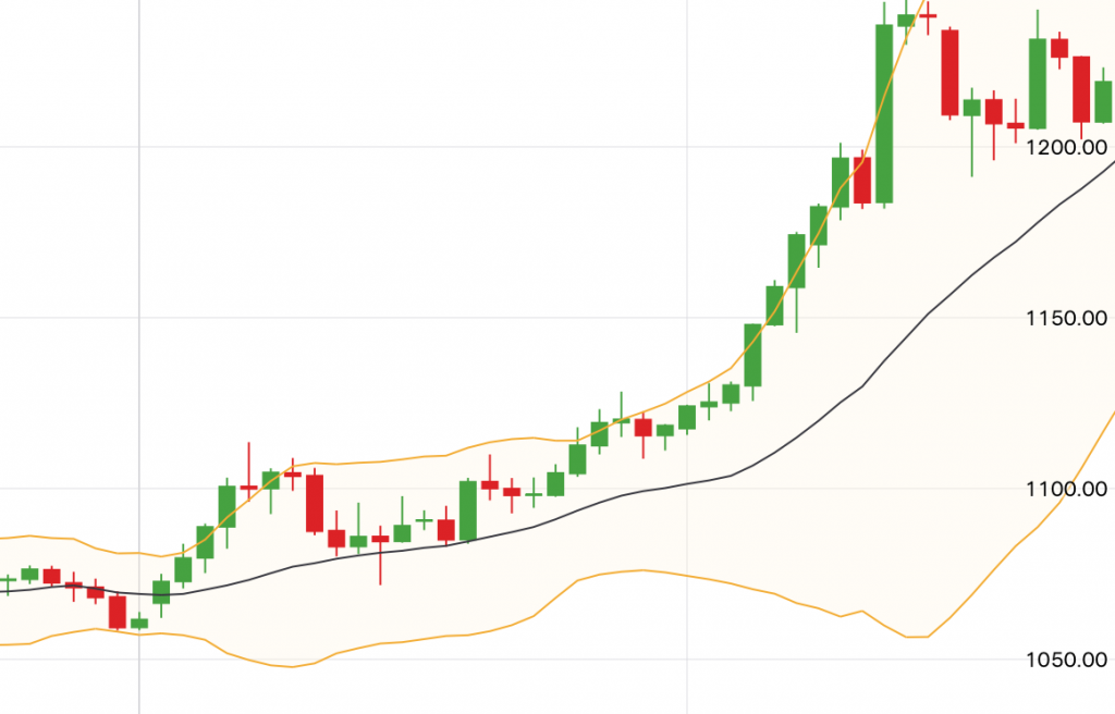
Ok, I think I need to explain something here, the human brain is hard-wired to find patterns. Cavemen who were better at recognizing patterns such as seasonal plant growth and animal migrations were better able to forage and hunt. Being a better hunter-gather meant you were more likely to find a mate a pass on your genes.
We also suffer from something called confirmation bias, this means if we have a belief, we will see evidence that supports us more easily than we will find evidence to the contrary.
So when it comes to finding a winning strategy by looking at lines on a chart, there are 60,000 years of evolution working against you. Using computers to analyze trading strategies removes all those biases and stops our brains from deceiving us.
Ok, back to the topic at hand. The first step in any exercise is to get the data. Being an amateur trader I have an account with a broker that happened to have a JSON API. So with a few GET requests in python I had downloaded just over 5000 rows of end-of-day price data for gold. I imported the price data files into R Studio. Through many internet searches, I tracked down the maths behind many of the most common indicators. In R studio I added a new column to the data for each indicator. In all, I now had 32 indicators calculated across 75 columns of data.
I plotted one indicator on the X-axis and one on the Y-axis, the next day’s price movement determined the colour. If the indicator had a predictive value, we would expect to see a grouping of the colours. In the Bollinger band plot, each dot below the horizontal 0 represents a candle that closed below the Bolinger band. Each dot below 0 on the vertical axis is a candle that closed above the upper Bolinger band. By looking at the plots, it appears the Bollinger bands have no predictive value.
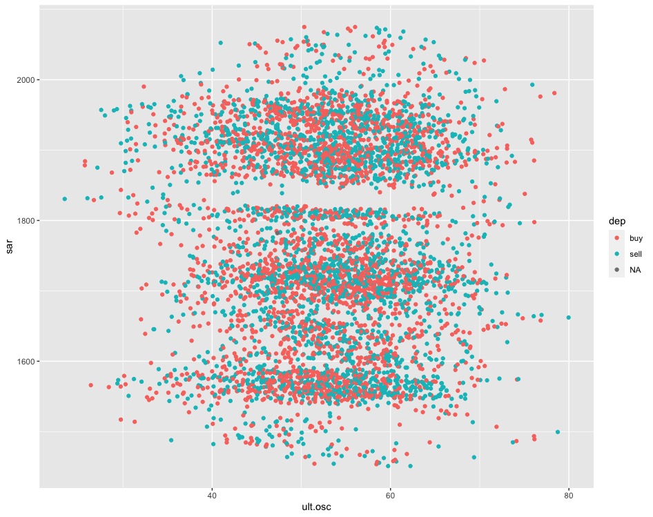
Ultimate Oscillator and SAR indicators 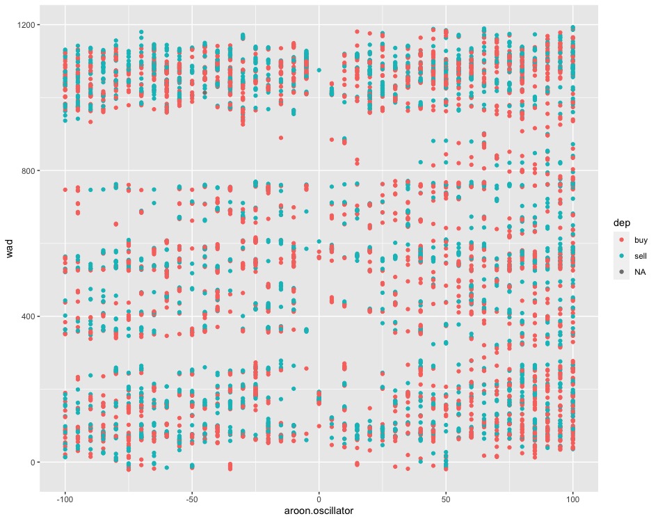
Williams and Aroon indicators 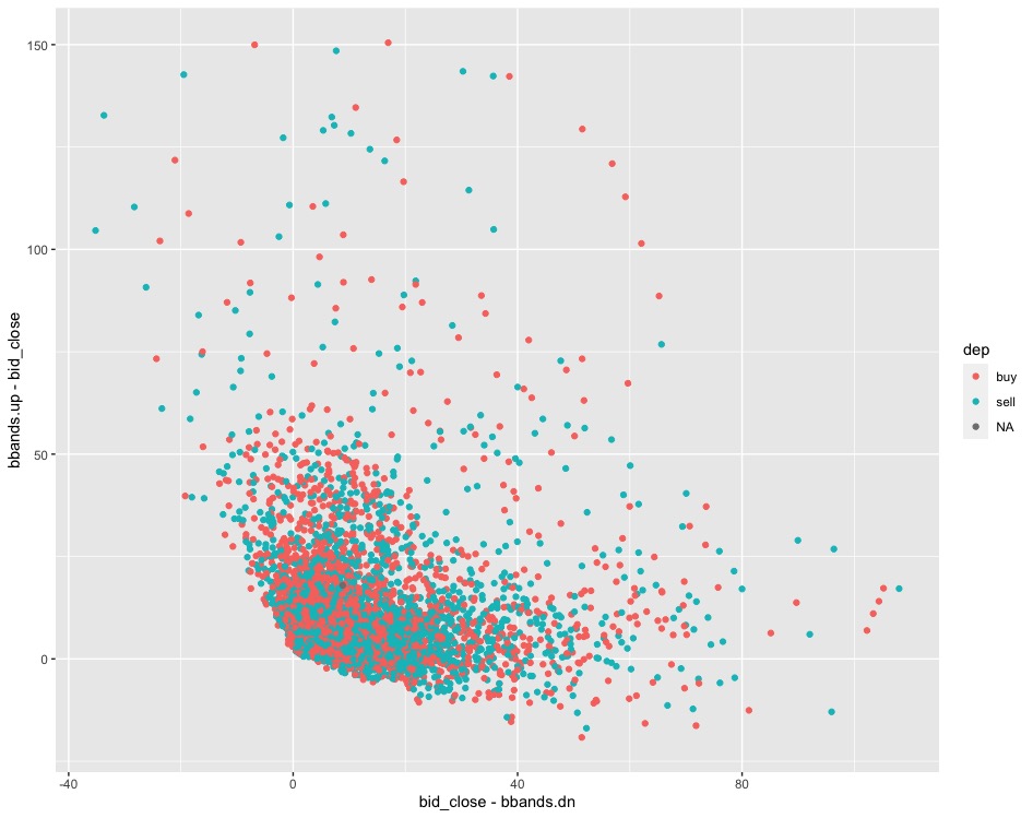
Upper and Lower Bollinger bands
This can be tested further by filtering the results and looking at the table of proportions.
Buy = 0.5302%
Sell = 0.4697%
If today’s price closes below the lower Bolinger band, then there is only a 53% chance tomorrow’s price will go up. This is only 1.3% above random selection.
I tested all the indicators in this method, most fell within the 50 – 55% range. To check if a combination of indicators might yield better results, I used R to create a random forest and a quadradic classification model. The best performer was the random forest which reached 59% in one node but contained only 9% of the data. The quadradic classifier only reached a meager 55%.